An Amazing Organization. A Website That Wasn't.
Wee3Beasties is a 100% volunteer-run nonprofit dedicated to trapping, neutering, and rehoming feral and stray cats around New Prague, MN. Their website existed — but barely. Families looking to adopt, people wanting to donate, and potential volunteers were met with broken links, inaccessible design, and unclear next steps.
The current site fails accessibility standards, lacks information about adoption, donation, and volunteering, and provides no clear path forward for any of its key audiences.
Reorganize the site map, refresh the style guide, and redesign for responsiveness — with a clear focus on connecting adopters, donors, and volunteers to the cats who need them.
"It is not serving any real purpose. It exists as a conduit right now — has a lot of potential to be very helpful!"
— W3B Founder, Stakeholder InterviewUnderstanding the Current Site & Its Users
Heuristic Evaluation
The team evaluated and annotated the existing site across three key pages — homepage, animals page, and about us. The issues went beyond aesthetics: accessibility failures, broken links, missing information, and confusing navigation made the site difficult for the audiences it most needed to serve.
Stakeholder Interview
I conducted a 30-minute Zoom interview with the founder while a teammate took notes — using Otter AI for transcription. The conversation surfaced both organizational priorities and specific design preferences that shaped every decision that followed.
Led the stakeholder interview. Prepared questions, facilitated the conversation, and identified key action items for the redesign.
Competitor Analysis
We analyzed shelters and rescues that users mentioned during interviews — chosen because they represent what the W3B audience already knows and expects. The gap was clear: W3B offered many of the same services but provided far less information and process clarity online.
Themes from Research to Direction
Affinity Diagram
Insights from four user interviews were grouped into four themes that aligned with both user needs and stakeholder goals — adoption, shelter information, donations, and visual content.
- Motivated to adopt older cats
- Wants easy adoption process
- Needs medical history upfront
- Expects to meet cat first
- Adoption info too vague
- Wants a phone number
- Wants to see where cats are kept
- Prefers items over money
- Loves the Amazon wishlist
- Wants to know where money goes
- Curious: adoptable vs sponsor only
- Cat photos are nice — too small
- Loves featured pet section
- Facebook callout well received
- Font color choices hard to read
User Persona
Built from stakeholder demographics and user interview insights — Carla, a 32-year-old marketing manager in St. Paul with two adopted cats, who wants to bring home a feral cat but feels lost in the process.
Card Sorting & Site Map
Five card sorts revealed confusion in the existing navigation — a mix of top, side, and footer nav with no clear logic. The stakeholder's request for new informational pages made a restructured site map essential.
My card sort focused on reorganizing primary navigation to accommodate new pages. I moved "My Rescue" to the footer (low priority) and elevated Facebook and donations to the top — reflecting what both users and the stakeholder told us mattered most.
Key pages buried under a "More" tab. Login and shopping cart icons with no clear purpose. No footer navigation.
Clear primary nav: Home, Adopt, Support Us, News & Events, Contact. New pages added: volunteer info, stray/feral guidance, cat introduction resources, shop, glossary.
Sketches to Screens
Each team member built individual sketches and lo-fi wireframes. We reviewed together and combined the strongest elements into shared mid-fi designs — one page per person in a shared Figma file, so we could see how pages were shaping up alongside each other.
- Adoption form and detailed process/FAQs
- Adoption counter and recently adopted section
- CTAs throughout: donate, sponsor, volunteer
- Large banner image to lead with W3B's strongest asset — the photography
Sketch Wireframes
Mid-Fidelity Wireframes
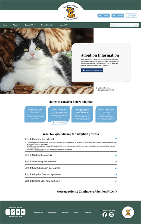
After mid-fi testing, testers found the adoption info page too long. Changes: FAQs moved to their own page, application moved to a separate page requiring deliberate intent, and sponsorship CTAs at the end reconsidered as off-topic.
Building a Shared Visual Language
A teammate created the final style guide from our collective moodboard research and stakeholder color preferences. I then built the Figma color and font library for the full team to use — ensuring consistency across five simultaneously-developed pages.
Created the Figma component library (colors, typography, button components with hover states) from the agreed-upon style guide. Also built reusable button components, made footer hover effects, and cleaned up teammates' files — aligning elements to the grid and standardizing spacing across pages.
Desktop & Mobile
Each team member applied the style guide to their assigned page. The final header was a compromise between two designs; the footer was one of my two proposed options. Three rounds of iteration on the adoption page based on testing feedback.
Adoption Page — Three Versions
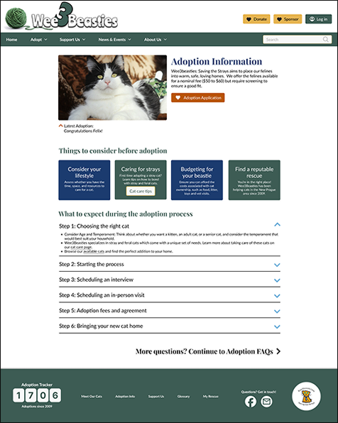
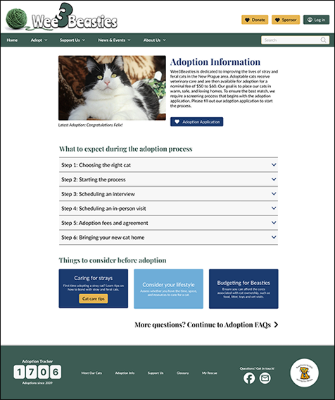
Final Desktop Screens


Mobile Prototype
For mobile I broke the adoption application into four shorter pages — making the process feel less daunting on a small screen. I also took a teammate's menu drawer and made the dropdown arrows functional between v1 and v2.
- Reformatted desktop footer for mobile — shared with full team
- Revised menu drawer dropdown functionality
- Split adoption application into 4 mobile pages for usability
What I'd Do Differently
This project produced a genuinely useful redesign for an organization that needed it. It also surfaced real lessons about team design workflow that I'd apply immediately if starting over.