The Problem & Solution
The National Weather Service provides comprehensive weather, water, and climate data for the United States — but their site fails the users it's meant to serve. An average person looking up air quality conditions or a local forecast is met with a cluttered, inconsistent, non-responsive interface that feels overwhelming at first glance.
As a UX researcher and UI designer, I conducted full user testing and heuristic analysis of the current site, then led a responsive redesign — bringing clarity, accessibility, and mobile usability to a data-rich government site.
Weather.gov has no mobile-responsive design. Users are overwhelmed by technical jargon, redundant navigation, and inconsistent layout — leading them to favor ad-heavy commercial alternatives over the most authoritative source available.
A responsive web redesign addressing key usability failures: plain-language explanations for technical data, a consistent and streamlined navigation, and a mobile-first layout that works on any device.
Understanding the User
I began this project by creating a proto-persona — a research-based composite user to guide design decisions. My user, Donna, is someone who suffers from asthma and allergies and visits the NWS site to understand air quality alerts and local forecasts. She represents an underserved segment of the site's audience: a health-conscious person seeking clear, actionable weather information on any device.

Donna is an active woman who lives in a suburb of Boulder, CO. An avid hiker and gardener, she suffers from allergies and asthma and has become increasingly concerned about air quality. Donna is tech-savvy and uses the internet regularly to stay informed about weather conditions and environmental factors that affect her wellbeing. She values clear, trustworthy information she can easily understand and apply to her daily routine — and is determined not to let her health condition limit her active lifestyle.
- Maintain an active lifestyle
- Stay up to date on air quality in her area
- Learn how to protect her health outdoors
- Trustworthy, location-specific information
- Detailed forecast to safely plan activities
- Practical tips for adverse weather days
- Information too technical to understand
- Overwhelmed by the volume of data
- No mobile-friendly site with complete info
- Simplified terms alongside technical data
- Location-based alerts and preferences
- Responsive design for weather.gov
Testing the Current Site
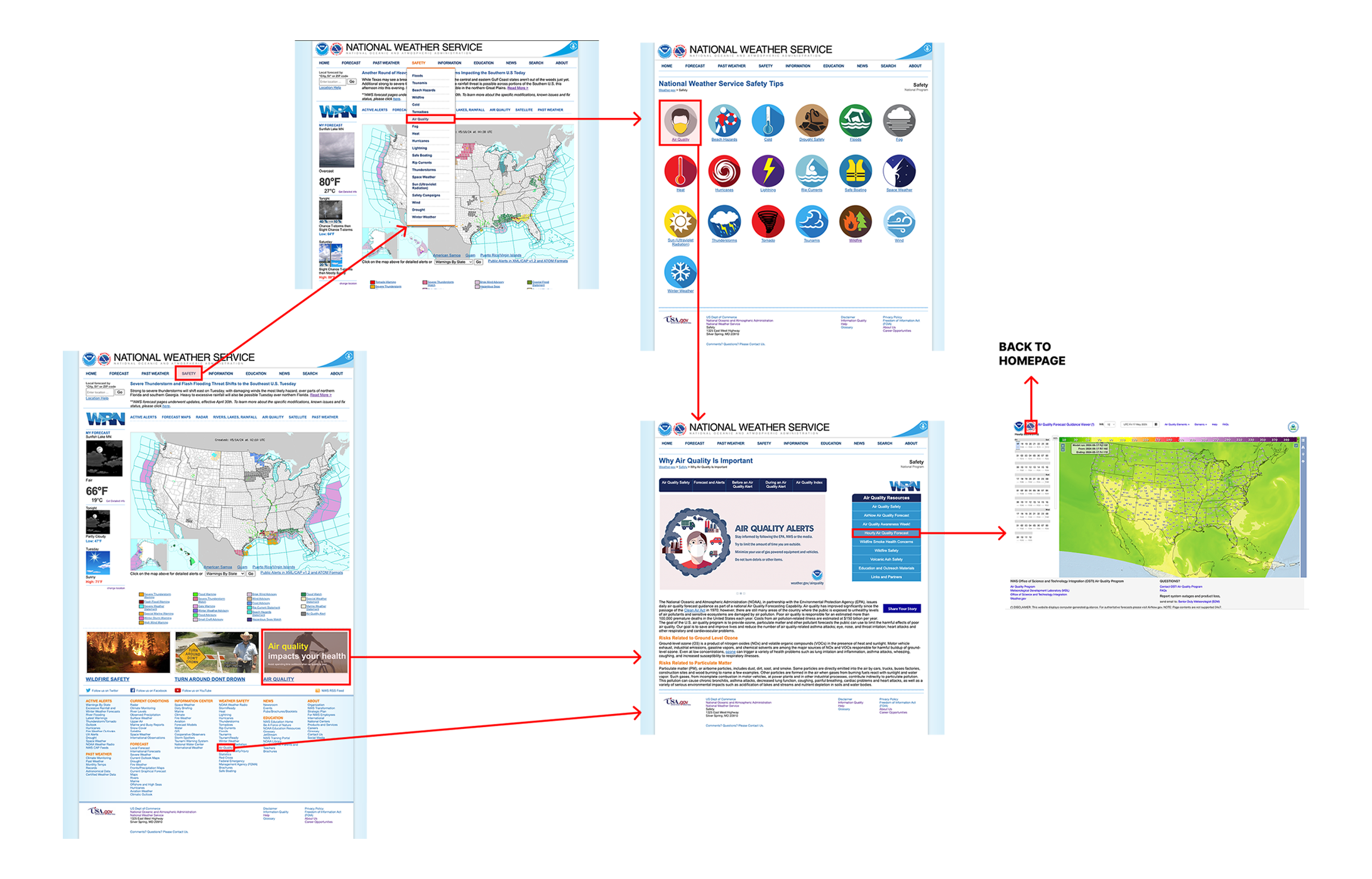
I want to understand how effective the NWS site is for the average person to find relevant weather and air quality information. I designed a usability test plan with three tasks based on my proto-persona and conducted five moderated user tests — one on mobile.weather.gov (a hidden, limited mobile site discovered only after my first test on the full site on mobile), and four on a desktop computer.
Key Takeaways
- Users struggled to find current air quality — confused by repetitive links spread across both primary and footer navigation
- Once on the correct page, unexplained technical jargon and confusing map controls made the data unusable for average users
- All testers completed Tasks 1 and 3 but reported frustration — confusing navigation and overwhelming homepage content
- A hidden mobile site (mobile.weather.gov) exists but offers severely limited functions and an outdated UI
- Testers were immediately turned off at first glance — but found genuinely good content after being forced to explore during testing
Empathy Map & Heuristic Findings
Users prefer alternative weather apps due to the overwhelming, outdated UI — but they appreciate the lack of ads and trust NWS as an authoritative source. The core tension: users value NWS data, but can't navigate the site well enough to use it.
The site is extremely cluttered, inconsistent, and overwhelming. My heuristic findings aligned directly with tester reactions — they were immediately put off and said they would not return if they had discovered the site on their own.
The primary color choice across the site — orange or blue text on a lighter blue background — fails both AA and AAA WCAG contrast standards. Small default font sizes throughout compound the accessibility issues.
Competitive Analysis
I surveyed my user testers to identify which weather resources they use, then analyzed the top competitors. AccuWeather, The Weather Channel, and Weather Underground offer extensive features but are criticized for cluttered, ad-heavy interfaces. AirNow and Google Weather stood out for clean, modern UIs and easy-to-understand information — confirming that users want reliable data in an accessible format.

- Feature-rich with detailed forecasts
- Ad-heavy and visually cluttered
- Strong mobile app

- Outdated UI design
- Criticized for visual overload
- Heavy advertising throughout

- Highly granular, hyperlocal data
- Balanced mix of relevant news and data
- Excessive advertising and clutter

- Clean, focused interface
- Easy-to-understand air quality data
- Educational and accessible

- Modern, minimal design
- Highly accessible at a glance
- No clutter or advertising
"Users appreciate reliable, detailed, accessible weather data — with a clear preference for interfaces free from excessive advertisements and technical overload."
Research Priorities
Clarity & language
- Increase font sizes throughout
- Add plain-language explanations for technical data
- Fix color contrast to meet WCAG AA minimum
Responsive design
- Develop a fully responsive layout
- Replace the hidden mobile.weather.gov
- Optimize touch targets and readable type
Structure & flow
- Group content into clear, labeled chunks
- Reduce navigation repetition across pages
- Apply consistent grid and element patterns
Restructuring the Navigation
To understand the current IA, I conducted a second round of heuristic analysis focused entirely on navigation — then collaborated with classmates on a card sort to reorganize the site's content. My analysis revealed a navigation system with serious structural problems: inconsistent menus, hidden links, multiple redundant pathways, and no indicators when leaving the NWS site.
Key Navigation Findings
- Social links hidden and using outdated logos — missed opportunity for authority and trust signals
- Bottom navigation crowded with confusing, low-contrast links and poorly organized content
- Primary navigation missing on some interior pages; secondary navs inconsistent and sometimes redundant
- Dropdown order does not match page order; some pages include a tertiary nav adding further confusion
- No indicators when leaving the NWS site — a common occurrence given the breadth of linked external data
Card Sorting
I collaborated with classmates to narrow the site to 28 cards for the initial sorting activity, then conducted my own card sort — combining primary and footer nav, removing all duplicates, and tracking off-site and broken links separately. The exercise confirmed my instinct to implement category-based organization in the primary nav, with alphabetical hierarchy within each category to increase findability. The large footer menu was significantly reduced based on user feedback.
Reduce bottom navigation links · Remove redundancies · Group like content in primary nav
Revised Site Map
My revised sitemap simplified navigation by using categories to group links inside main headers, with alphabetical ordering within each group to increase content-finding speed. Primary dropdown menus are now larger and more organized, while the footer was greatly reduced based on direct tester feedback.
From Research to Screens
For the design phase, our team worked collaboratively in a shared Figma file — each member responsible for their assigned page while sharing headers, footers, and a component library. I created and organized the font and color library in Figma based on the team's finalized style guide.
Created the Figma font and color component library · Built button components for team use · Made hover effects for footer links · Took the primary nav designed by a teammate and made it functional · Cleaned up teammate files to align with the grid · Created the mobile prototype split across 4 pages · Revised menu drawer dropdown arrows to function correctly between v1 and v2
Mood Board
For design inspiration I gravitated toward sites that use large imagery and bold color to highlight critical information rather than as pure decoration. Our stakeholder preferred bold, solid colors — so I looked for references that balance strong color blocks with generous white space. I was particularly drawn to examples that use color purposefully to draw attention to alerts, forecasts, and key data.
Style Guide
A team member was assigned the task of creating the final style guide from our shared inspiration. I then took the finalized colors and fonts and built a shared library in Figma for the full team to use consistently across all pages.
Mid-Fi Wireframes
Each team member built out mid-fidelity wireframes for their assigned page in a shared Figma file. This let us see how other pages were taking shape and agree on a consistent header and footer style. After 6 mid-fi user tests, I streamlined the footer, introduced more white space, and cleaned up margins before moving to hi-fi.
Hi-Fi Design & Iterations
At this stage each team member applied the style guide to their page. We then came together to agree on shared headers, footers, and elements — the final header was a compromise between my design and a teammate's, incorporating a new logo. I created button components for all team pages and made footer link hover effects.
Mobile Prototype
For the hi-fi mobile version I broke the page into 4 shorter screens — having shorter, focused screens makes the content feel less daunting on mobile. I reformatted the desktop footer for mobile and shared it with the rest of the team. Between v1 and v2, I took the menu drawer a teammate designed and revised the dropdown arrows to function correctly.
What Worked. What's Next.
The NWS site is a case study in the gap between a reliable information source and a usable product. Testers forced to spend time on the site discovered genuinely valuable content — but would never have found it on their own. The redesign addresses the most critical barriers: a responsive layout, readable type, and simplified navigation. If I were restarting now, I'd consider breaking the site into three distinct entry points based on user type — an approach that would better serve both the general public and the agency's data-driven professional users.