The Problem & Solution
Parents want to take trips with their families but find the planning process overwhelming — too many tools, too many tabs, and no single place to keep everything together. Bon Voyager brings the entire planning process into one app: destination research, itinerary building, packing lists, and shared family access.
Busy parents struggle to coordinate family travel because planning is scattered across apps, emails, tabs, and notes — with no single source of truth.
A mobile app that centralizes every step of trip planning — from inspiration to packing — designed specifically for families with kids.
"Bon Voyager is the planning co-pilot for family travel — one place for every list, destination, and itinerary detail, so the trip actually happens."
What Parents Really Need
I conducted 5 user interviews and ran a 43-response survey targeting parents who plan family travel. Initial assumptions pointed toward discovery features — finding new destinations. What interviews revealed was different: the real frustration was organization. People already knew where they wanted to go. They needed help getting there.
Key Takeaways
- Parents feel overwhelmed by trip planning — not because they lack ideas, but because nothing stays organized
- Most families use 3–5 different tools (Google Docs, email, notes apps, travel sites) for a single trip
- Shared access with a partner or co-parent was a consistent unmet need — planning is rarely a solo task
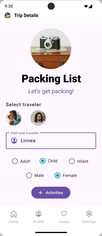
- Packing lists are rebuilt from scratch for every trip — no one has a reusable system that actually works
- Parents want simplicity over features — they would trade functionality for something they can actually use quickly
From Insight to Direction
User Persona
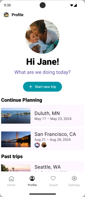
Research aligned on a clear user: Jane Flaherty, a 41-year-old working parent who travels 2–3 times a year with her family. She starts planning weeks out but loses momentum when information is scattered. She wants one app that keeps everything in one place — and that she can share with her partner without starting over.

Jane is a 41 year old, married, mother of two. She and her husband met in high school and still live in the same hometown as they grew up in. Free time is hard to come by with two elementary aged kids, so she makes the most of it when it comes around. In her spare time she enjoys playing sports, visiting friends, reading or hanging out with the family dog. When traveling, family comes first. These days it's all about kid friendly destinations and getting there as quick as possible.
- See beautiful locations and experience new things
- Spend quality time with family
- Take a stress-free trip everyone actually enjoys
- Let kids weigh in on decisions to keep everyone happy
- Clean, family-friendly accommodations (hotel with breakfast)
- Wishes someone else would take charge of planning sometimes
- Finding travel dates that work for the whole family is a challenge
- Too busy to think about trip planning until it's last minute
- Hard time deciding where to go and what to do once there
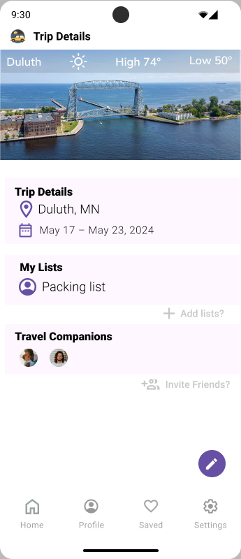
- One centralized app for itinerary, packing, and logistics
- Shared access so partner can co-plan without starting over
- Kid-friendly destination filters and activity suggestions
"Busy parents feel overwhelmed by family trip planning — not by a lack of ideas, but by the chaos of managing details across too many disconnected tools."
Competitor Analysis
Direct competitors (TripIt, Google Travel, Wanderlog) each solve part of the problem — itinerary import, map saving, or list making — but none address the family-specific experience: shared access, kid-friendly packing templates, and delegation across family members.
Trip creation wizard, shared itinerary access, smart packing lists with family member assignment, offline access
Destination discovery, booking integrations, loyalty program tracking, flight status alerts
Sketch to Screen
I worked through four fidelity levels — paper sketches, lo-fi, mid-fi, and a full hi-fidelity prototype in Figma — refining the flow and visual system at each stage based on testing feedback.
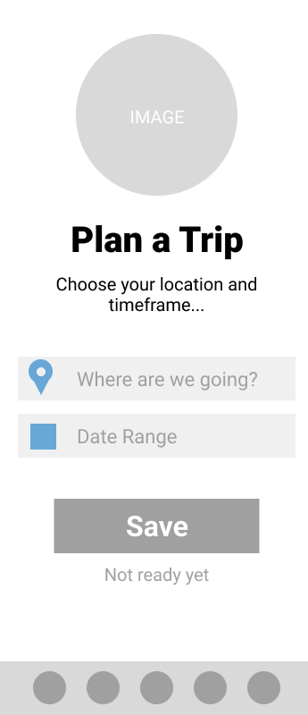
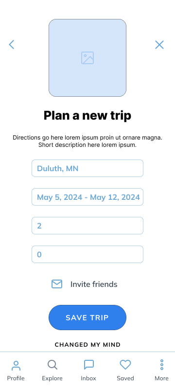
Wireframe Progression

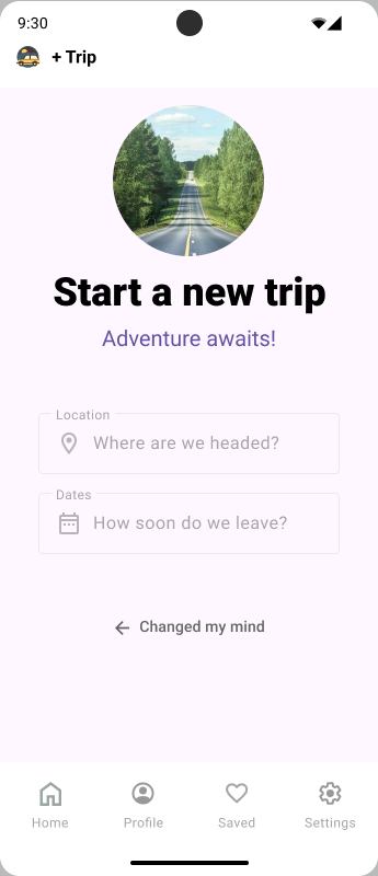
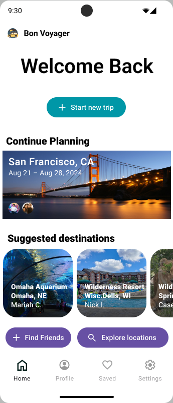
Final Screens
Four Rounds, Clearer Every Time
I ran four rounds of guerrilla testing with different users at each stage — paper, lo-fi, mid-fi, and hi-fi. Testing revealed navigation issues, unclear affordances, and a trip creation flow that asked too much too early. Each round drove concrete changes.
Guerrilla usability testing — recruited participants in person and remotely, gave scenario-based tasks, observed without guiding, and captured all feedback in FigJam for synthesis.
Key Iterations from Testing
- Simplified trip creation — removed multi-step wizard in favor of a quicker "name + dates" start with details added later
- Moved packing lists to a persistent bottom tab — users couldn't find it buried in the trip detail view
- Clarified "Invite Partner" CTA — original label ("Add Member") was consistently misread as adding a traveler, not a co-planner
- Increased contrast and tappable area on key CTAs after round 3 — several users missed the primary action on first tap
What I'd Do Next
Bon Voyager was my first solo end-to-end UX project — and the one that taught me the most about the gap between what you assume users want and what research actually reveals.