Outcomes, Inc. provides vital services for disabled adults and children in the community Their website wasn't reflecting that. Families searching for support, individuals looking for resources, and donors wanting to help were met with frustrating navigation and unclear paths forward.
I approached their director with a pitch for a full redesign, backed by a heuristic analysis, a new site map, and a preliminary competitor analysis.
The project spans several phases with goals across three timeframes: immediate fixes, short-term wins, and a long-term structural redesign.
The Problem
The current site is not attracting new employees. A disjointed sitemap and lack of pertinent information are resulting in high bounce rates and preventing the organization from growing and serving the community.
The Solution
A phased redesign — fixing immediate usability issues first, then restructuring the site with clear calls to action segmented for prospective clients, donors, and job applicants.
Goals by Phase
Immediate
Quick fixes
Fix broken links
Ensure usability at all breakpoints
Remove confusing elements
Short Term
Drive engagement
Increase job applicants
Build out donation page
Clarify information architecture
Long Term
Scale the platform
Accept online donations
Build employee portal
Add event calendar for clients
Accept applications online
Research Phase
Understanding the Current State
Before meeting with the stakeholder I conducted a heuristic evaluation of the existing site and a competitor analysis to identify key pain points and opportunities — building the foundation for a pitch to the Executive Director.
Research — Heuristic Evaluation
What Wasn't Working
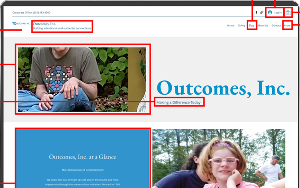
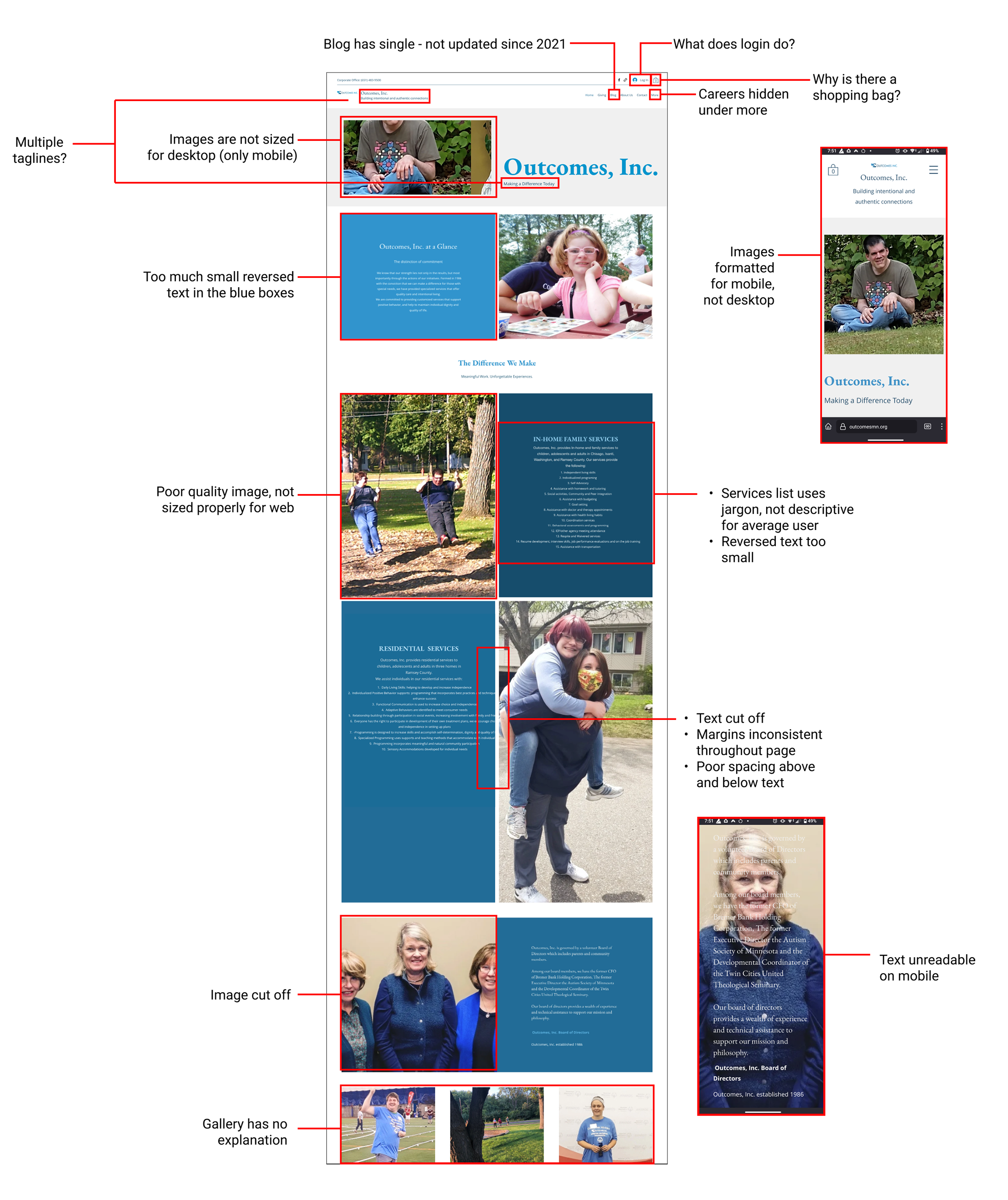
A thorough review of the existing site revealed issues across formatting, language, accessibility, and information architecture — many of which were immediately actionable.
Heuristic evaluation of the existing Outcomes Inc. site — annotations mark key usability, accessibility, and information architecture issues
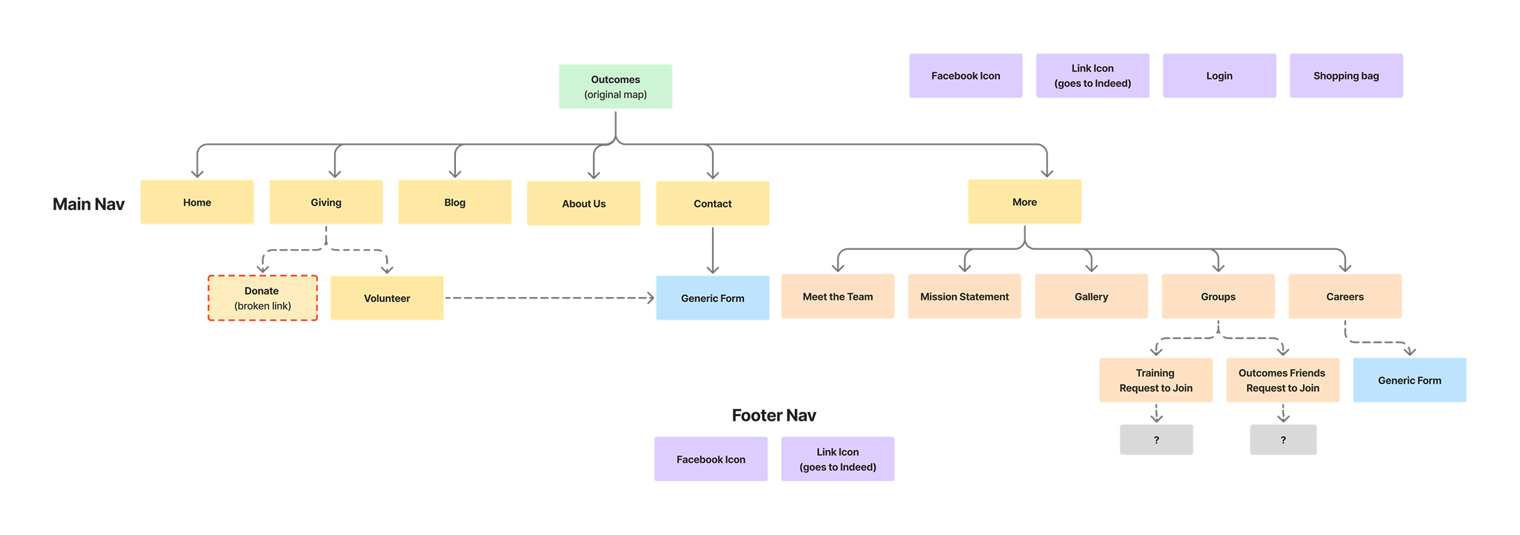
Confusing Information Architecture
Key information hidden under a "More" tab — important content buried from primary navigation
Confusing UI elements — shopping bag icon, login button, and groups page with no clear purpose
Lack of CTAs throughout — no clear next steps for visitors who want to donate, apply, or seek services
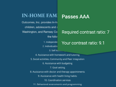
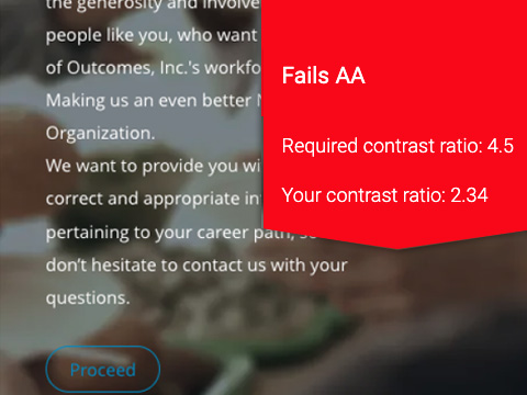
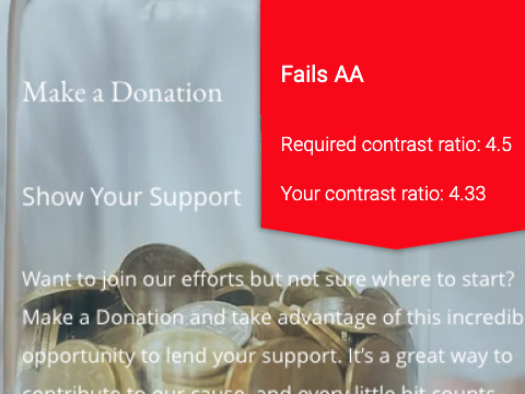
Accessibility Failures
Reversed text fails WCAG contrast requirements on all but the darkest blue backgrounds
Body copy too small overall — readability issues for the site's likely audience of older adults and families
Layout and Formatting Issues
Images do not resize properly on desktop — inconsistent margins and text cut off across breakpoints
Blog has a single entry dated 2021 — signals an inactive, unmaintained presence
Language and Tone
Jargon used in place of everyday language — creates barriers for families and first-time visitors
Mission statement buried and inconsistently worded across pages
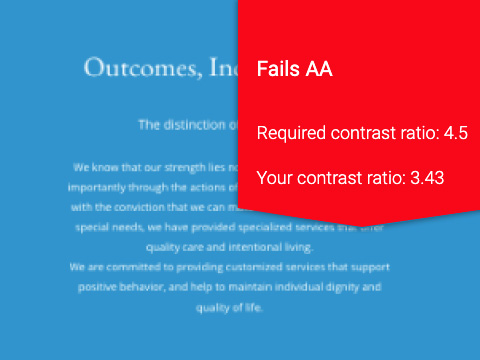
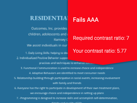
WCAG Accessibility Audit
Color contrast testing against WCAG standards revealed widespread accessibility failures — a critical issue for a nonprofit serving disabled individuals and their families.
WCAG contrast testing across the five primary color combinations used on the existing site
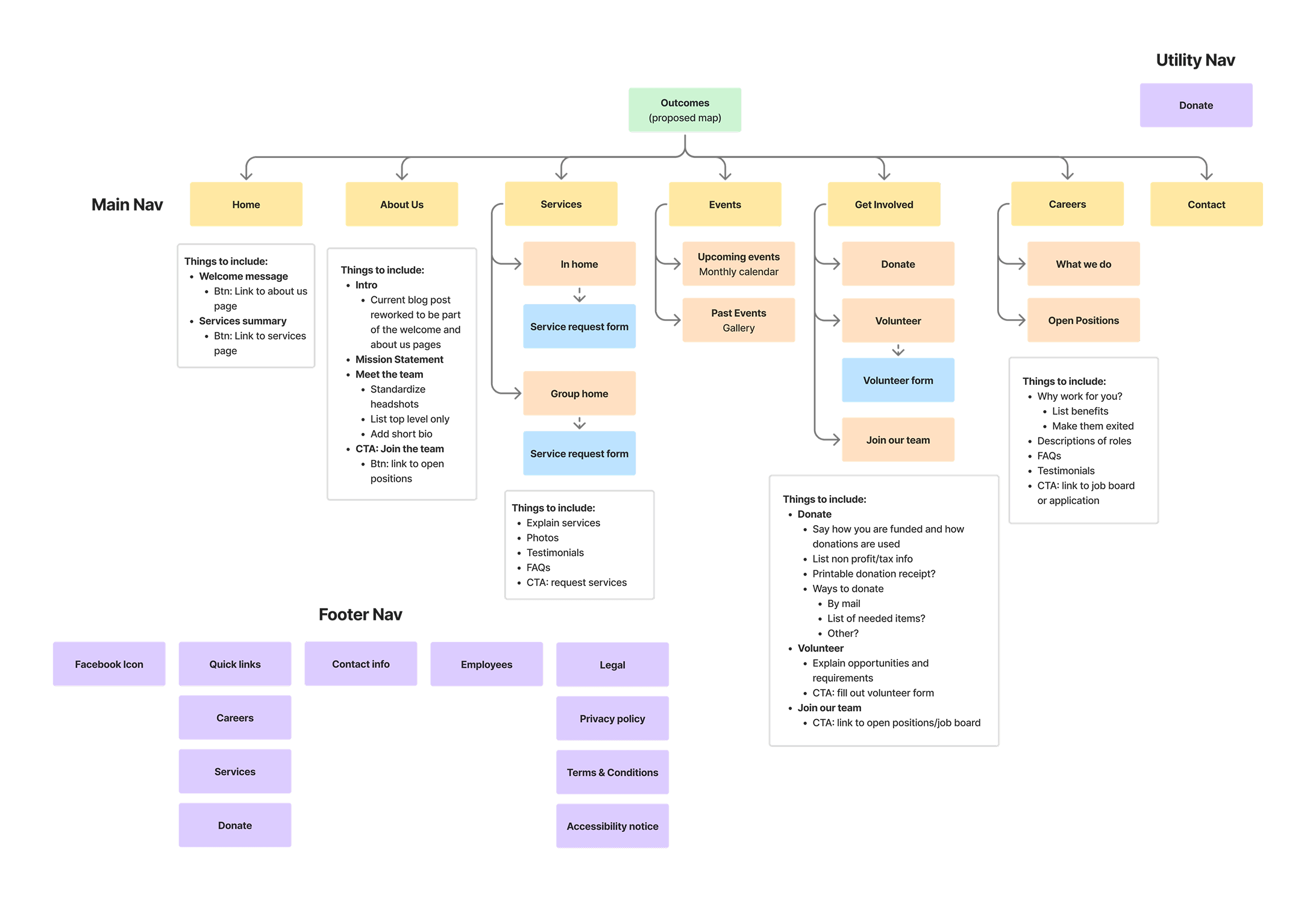
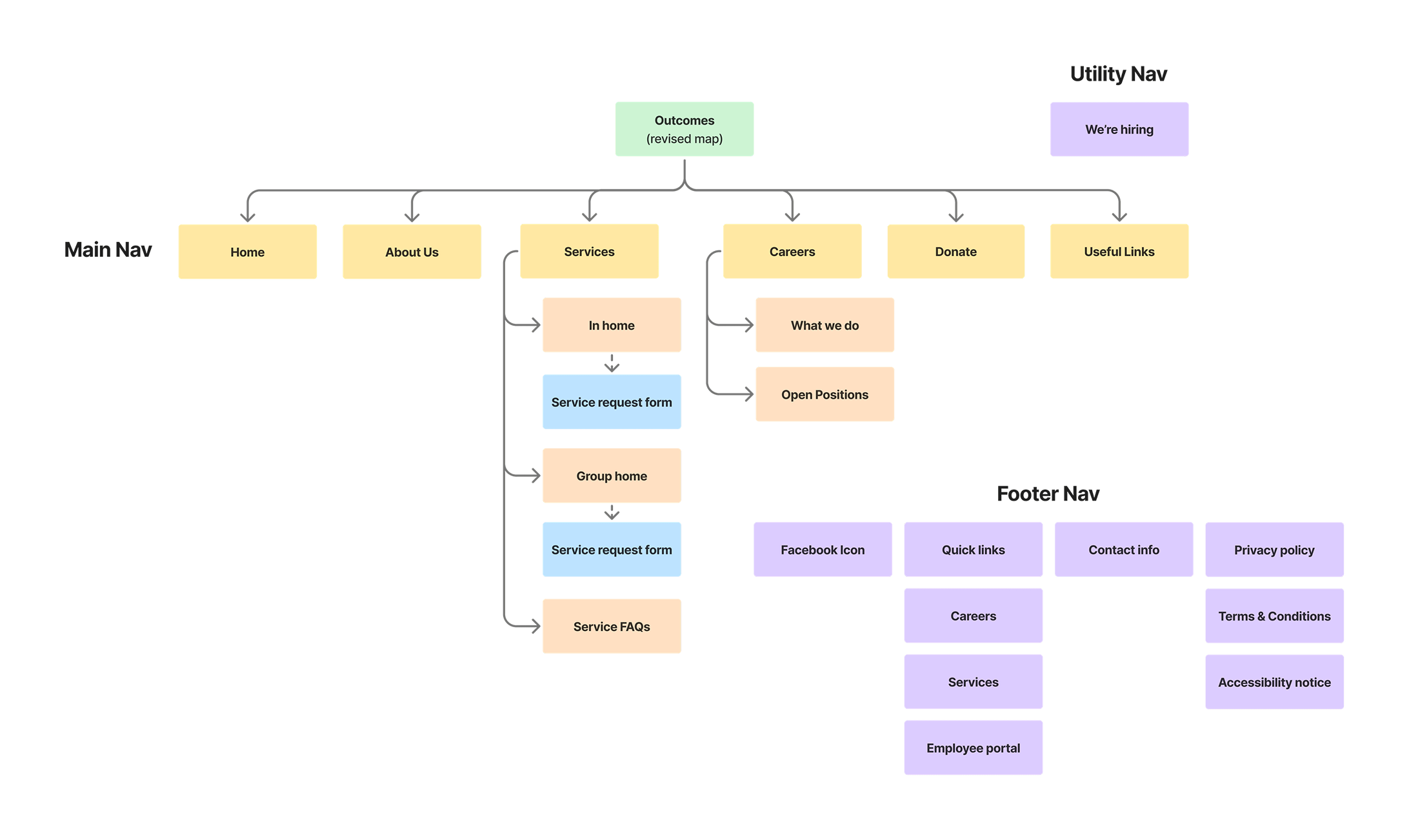
Research — Information Architecture
Restructuring the Site Map
The original site hid several key sections under a "More" dropdown — including hiring information that the organization most needed to surface. I proposed a restructured site map, then revised it again after the stakeholder interviews to prioritize hiring over donations.
The revised map elevates hiring into primary navigation and removes confusing elements identified in the heuristic evaluation
Research — Stakeholder Interview
In-Person Interviews with Leadership
I conducted in-person interviews with both the Executive Director and the Lead In-Home Coordinator — presenting my research, proposed site map, and initial competitor analysis as a pitch for the project. The conversation surfaced priorities I hadn't anticipated and shaped the direction of the redesign.
Immediate Actions
Remove unnecessary elements
Fix overset text throughout
Repair all broken links
Short-Term Goals
Increase job applicants
Build out donation page — how funds are used, ways to give, wishlist items for group homes
Long-Term Goals
Accept donations online
Build employee portal with secure login and training materials
Add event calendar for clients
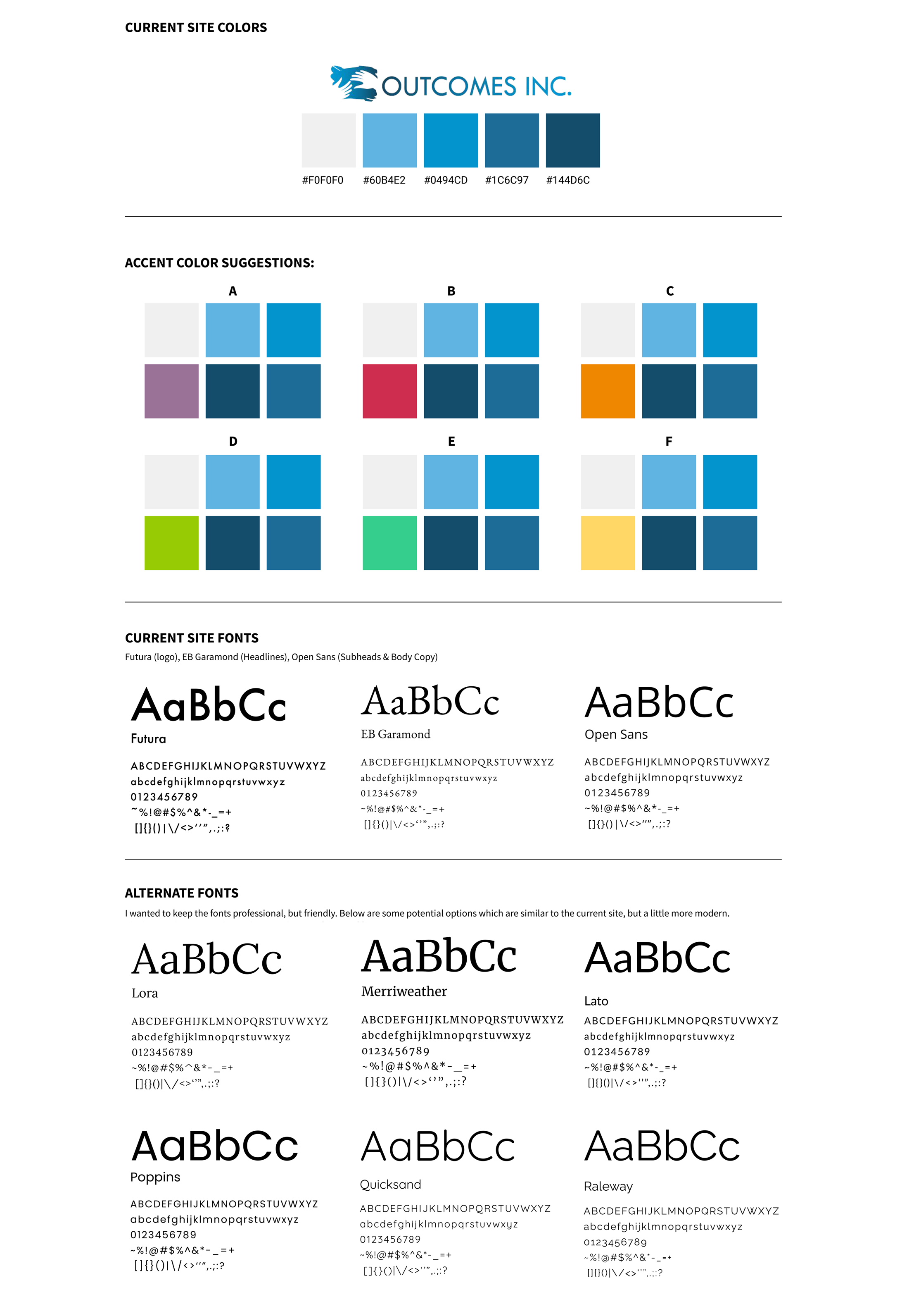
Design Direction
Color & Typography
Before moving into wireframes I explored color palette options and typography pairings — keeping the existing blues from the logo while evaluating accent colors and more modern serif alternatives.
What Comes Next
Next Steps
01
Mid-Fi Wireframes & Testing
Mid-fi prototype will be presented to the Executive Director for usability testing and iteration once draft content is in place from the Outcomes team.
↑ Current Stage
02
Hi-Fi Prototype
High-fidelity designs will go through rounds of iteration, then presented again for final approval before development.
Upcoming
03
Launch & Results
Once live, staff training materials will be provided and analytics reviewed at six months to measure impact on hiring and donations.